Stag Handbook
The Stag Handbook is a multidisciplinary art book that was created as a piece of world building and a concept for a prop to use in film and/or games. The process involved a multistage process involving branding design, illustration, concept art, writing, and editorial design.
Below I will detail my thought and design process that lead to the final product, strictly from a design point of view and leaving the world building and concept art sections to their relevant section in the game development section.
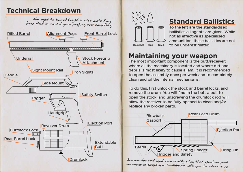
The illustrations are intended to be clear diagrams reminiscent of technical drawings commonly seen in firearms manuals. But with a slight influence from international or Swiss style that much like the previous discussion on brandings, is designed to date the design.
The editorial design style was intended to be like a simple pared down notebook, with some scrawlings to build a sense of familiarity and connection from the audience to the book itself. A human element with a story to tell, that directly engages with the audience and draws them deeper into the book and world that the prop was designed for.
The book was finished with a cloth cover with gold leaf that had been dirtied and weathered, again emphasising the minimalist approach, while creating an engaging element for the audience.
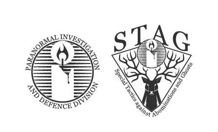
The branding use's a pictogram of both a candle and a stag shield; these were chosen first for the shield's symbol of strength, unity, and steadfastness which was a good fit for the fictional agency.
The combination of serif font for the logo was again informed by a sense of traditional values, but simultaneously worked to date the fictional agency, which again contrasted to the use of sans serif in the much later developed handbook.
The branding was used to convey links to paranormal and mystery, but in ways that would portray the agency in a positive light.