
Cardboard Empire
Carboard Empire is a branding style guide that was part of my major; it saw the creation of a brandmarks through text, colour, and a visual logo. But it also saw a wider branding strategy that addressed the tone of voice in it's content, and a font pairing system with colour palette system that was all designed to be complementary to the primary brand identity.
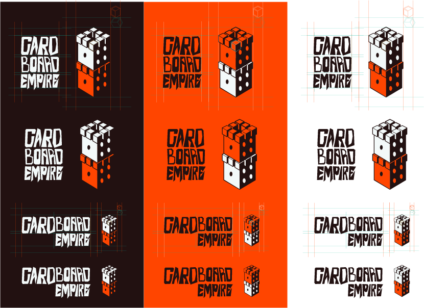
The branding was extensively checked for multiple colour schemes, different typesetting for different layouts, and sizing for the possibly tiny surface area that it would be presented on.
From this the branding was presented in a book that was intended to be as light hearted and bold as the branding was intended.
Finally as part of the project an example product was created to demonstrate the robustness of the branding system; which included mockups of the box, and card designs with stock image placeholders.